Case Study
LGBTQIA+ Community Center Website Redesign

My role: User interview and stakeholder interviews, user persona, user journey development, style guide, wireframes, and clickable prototype.
Tools: Figma, Zoom, Google Suite, Photoshop
Stonewall’s mission is dynamic and wide ranging but has a website that is static and clunky to use. Their current design makes it hard for users to engage with the organization and does not highlight and uplift resources in the ways they would like. An improved design with a more streamlined navigation system, clean aesthetics and a greater showcase of the organization’s people and their mission will better equip Stonewall to accomplish their goals in coming years.
Essential Project Question
How might we improve event attendance and donation rates for Stonewall Columbus through improved information architecture and aesthetic website interventions?
The Problem
Site visitors find the interface overwhelming, unclear, and text-heavy, inhibiting their ability to take action with or for the organization.
Stonewall Columbus website users think the navigation is challenging to use, leading to frustration and fall-through when attempting to engage with the site.
New users visiting the Stonewall Columbus website struggle to quickly and easily engage with the organization through their current interface.
User Interview key Findings

75% of donations to nonprofits come in cash form, creating opportunity for nonprofit websites to generate funds
Clarity and organization are essential to building trust in a website
A clear demonstration of an organization’s impact increases likelihood for volunteer engagement
A personal connection to a cause helps with volunteer recidivism
User Testing Results

The current site is inconsistent and hard to navigate
Users are confused by content organization and often got lost
Inconsistent style makes it unclear where paths lead
Site had broken links and a non-functional search bar
Buttons were all different shapes, colors, and sizes


User Persona

Mika Keller, 37
Account Manager
Mika is a community-oriented extrovert from Columbus, Ohio. He feels connected and supported through various queer groups around the city, like sports leagues and emotional support groups. He values his personal connections and wants to find an organization to connect with that aligns with his needs and values, while meeting new people, supporting others, and getting exercise/staying active.
“The people I’ve met and made friends with have kept me coming back to the same nonprofit time after time.”
Need/Desires
Find an organization to volunteer with where he feels like he’s having a real impact and connecting with people in his community
Feel mutually supported by this organization
Pain points
Finding organizations whose actions align with their mission and are transparent about funding and leadership agendas
Strengths, Weaknesses, Opportunities, and Threats
| Strengths Existing, active community/audience Good amount of events, support groups, and resources |
Weaknesses Text-heavy, visually inconsistent website makes engagement a challenge No search and repeating menu items make for poor navigation Confusing donation CTAs |
|
|---|---|---|
| Opportunities Increase event attendance Increase # of annual donations Increase volunteer recidivism rates |
Opportunity-Strength (OS) Strategies Engage donors with simple CTAs and forms, inviting interface Make volunteering appealing by sharing real stories and insights |
Opportunity-Weakness (OW) Strategies Demonstrate the impact of volunteers and donors |
| Threats Donations decreased during covid Catering to entire community means lots of opportunities and content |
Threat-Strength (TS) Strategies Leverage existing community? |
Threat-Weakness (TW) Strategies Fix search function, move to top Streamline donation-relation interface, fix broken links |
I Like, I Wish, What If?

After analyzing other site’s features and ideating on our own, we settled on the following design wish list for the Stonewall Columbus website:
Straightforward menu navigation
Bright, Inspiring Imagery
Prioritize typography from the queer community
Lively, consistent Color Scheme
Updated button styling
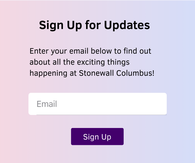
Personal, Local Content & Tone
User Scenario

User Journey

Site Map
Updated naming conventions
Consolidated Secondary and Tertiary topics
Changed menu interactions from mouse-over to clicks

User Flows

Task 1: Find Speaker Series Information
You belong to an organization who is looking to support your LGBTQIA + employees by having a guest speaker series. You’ve heard that Stonewall Columbus offers this, so you come to their website to see if you can do this online. Go to this site and sign up for a guest speaker.
Task 2: Find Your Connection
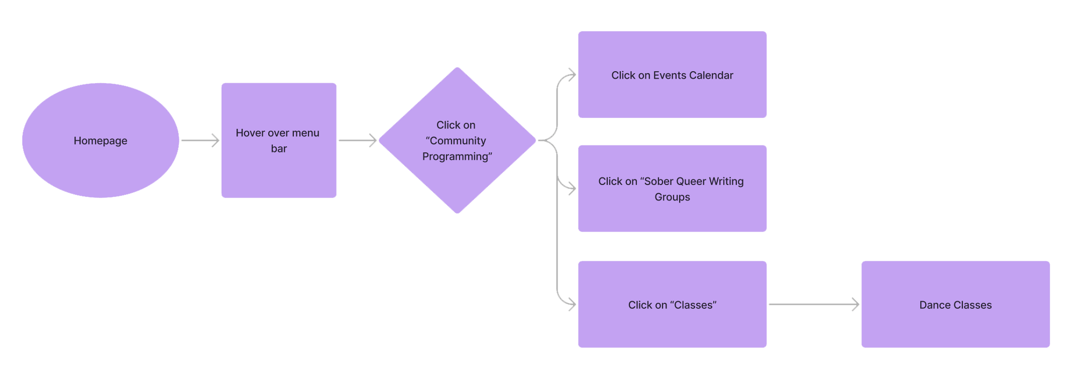
You are new to Columbus and have heard great things about the center. You think you might want to become a member, but you want to see what they have to offer first. You’re into writing, dance, and just general socializing. Go to their site and find something to do that interests you.
Styling
Primary Pallette
#43006C
#BBF3FF
#001A77
#FF8A1E
#FFC700
Gradients
Typography
Font: Clear Sans by Dan Rhatigan, Robin Nicholas, and George Ryan
Paragraph: Kind-hearted, fabulous queers embrace their fluid, diverse sexualities with zest
Bold: Kind-hearted, fabulous queers embrace their fluid, diverse sexualities with zest
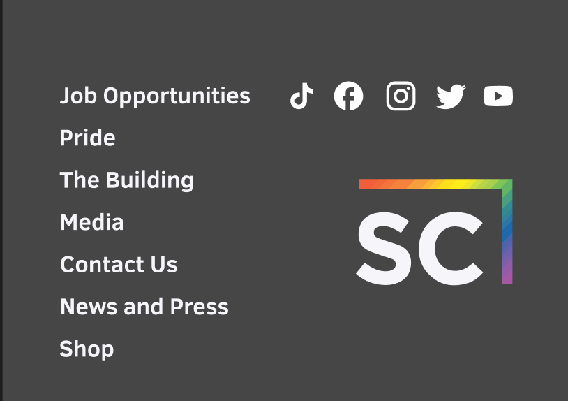
Card, header, and footer styles

Lo- to Mid-fi Prototypes


Final Hi-fi Prototypes


Next Steps
Incorporate Stonewall’s Style Guide
Increase micro-interactions to make the site more dynamic
Include a video site header showcasing the Pride Parade and work they do
Make Programs & Events pages more robust